<< 소스 코드 >>
import 'package:flutter/material.dart';

void main() => runApp(MyApp());

class MyApp extends StatelessWidget {
  const MyApp({Key? key}) : super(key: key);

  @override
  Widget build(BuildContext context) {
    return MaterialApp(
      theme: ThemeData(primarySwatch: Colors.blue),
      home: MyButtons(),
    );
  }
}

class MyButtons extends StatelessWidget {
  const MyButtons({Key? key}) : super(key: key);

  @override
  Widget build(BuildContext context) {
    return Scaffold(
      appBar: AppBar(
        title: Text('Buttons'),
        centerTitle: true,
      ),
      body: Center(
        child: Column(
          mainAxisAlignment: MainAxisAlignment.center,
          children: [
            //TextButton 구현
            TextButton(
              onPressed: () {
                print('text button onPressed');
              },
              //버튼을 오래 클릭 시 발생하는 이벤트
              onLongPress: () {
                print('text button onLongPress');
              },
              child: Text(
                'Text button',
                style: TextStyle(fontSize: 20.0),
              ),
              //TextButton 스타일 변경 시 TextButton.styleFrom 메소드 사용
              style: TextButton.styleFrom(
                // primary: Colors.red,  //primary 속성은 미사용
                foregroundColor: Colors.red,
                //backgroundColor: Colors.blue,
              ),
            ),
            //ElevatedButton 구현
            ElevatedButton(
              onPressed: () {
                print('Elevated button');
              },
              child: Text('Elevated button'),
              style: ElevatedButton.styleFrom(
                  //primary: Colors.orangeAccent,  //primary 속성은 미사용
                  foregroundColor: Colors.white,
                  backgroundColor: Colors.orangeAccent,
                  shape: RoundedRectangleBorder(
                      borderRadius: BorderRadius.circular(10.0) //버튼의 모서리를 둥글게 설정
                  ),
                  elevation: 0.0),
            ),
            OutlinedButton(
              onPressed: () {
                print('Outlined button');
              },
              child: Text('Outlined button'),
              style: OutlinedButton.styleFrom(
                //primary: Colors.green,  //primary 속성은 미사용
                foregroundColor: Colors.green,
                // side: BorderSide(
                //   color: Colors.black87,
                //   width: 2.0
                // )
              ),
            ),
            //아이콘이 추가된 TextButton 추가
            TextButton.icon(
                onPressed: () {
                  print('Icon button');
                },
                icon: Icon(
                  Icons.home,
                  size: 30.0,
                  //color: Colors.black87,
                ),
                label: Text('Go to home'),
              style: TextButton.styleFrom(
                //primary: Colors.purple,  //primary 속성은 미사용
                foregroundColor: Colors.purple
              ),
            ),
            //아이콘이 추가된 ElevatedButton 추가
            ElevatedButton.icon(
              onPressed: () {
                print('Go to home(ElevatedButton.icon)');
              },
              icon: Icon(
                Icons.home,
                size: 20.0,
                //color: Colors.black87,
              ),
              label: Text('Go to home'),
              style: ElevatedButton.styleFrom(
                //primary: Colors.black
                foregroundColor: Colors.white,
                backgroundColor: Colors.black,
                minimumSize: Size(200, 50), //버튼의 최소 크기 지정
              ),
            ),
            //아이콘이 추가된 OutlinedButton 추가
            OutlinedButton.icon(
              onPressed: () {
                print('Go to home(OutlinedButton.icon)');
              },
              icon: Icon(
                Icons.home,
                size: 30.0,
                //color: Colors.black87,
              ),
              label: Text('Go to home'),
              style: OutlinedButton.styleFrom(
                //primary: Colors.purple,  //primary 속성은 미사용
                foregroundColor: Colors.purple
              ),
            ),
            //아이콘이 추가된 ElevatedButton 추가
            ElevatedButton.icon(
              onPressed: null,  //버튼 비활성화 시 null 설정
              icon: Icon(
                Icons.home,
                size: 20.0,
                //color: Colors.black87,
              ),
              label: Text('Go to home'),
              style: ElevatedButton.styleFrom(
                //primary: Colors.black,  //primary 속성은 미사용
                foregroundColor: Colors.white,
                backgroundColor: Colors.black,
                //onSurface: Colors.pink
                disabledForegroundColor: Colors.pinkAccent, //버튼 비활성화 시, 색상 지정
                disabledBackgroundColor: Colors.pink[50], //버튼 비활성화 시, 색상 지정
              ),
            ),
            //ButtonBar는 버튼을 정렬하는 기능
            //ButtonBar안의 버튼을 한쪽 방향으로 가로정렬하고,
            //공간이 부족할 시, 세로 정렬을 한다.
            ButtonBar(
              alignment: MainAxisAlignment.center,  //버튼 중앙 정렬(Default : 우측)
              buttonPadding: EdgeInsets.all(20.0),  //버튼 사이 공간
              children: [
                TextButton(
                    onPressed: (){},
                    child: Text('Text Button'),
                ),
                ElevatedButton(
                    onPressed: (){},
                    child: Text('Elevated Button'),
                )
              ],
            )
          ],
        ),
      ),
    );
  }
}
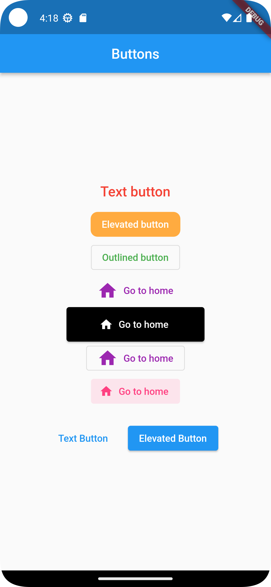
<< 출력 화면 >>
'Flutter (with 코딩셰프)' 카테고리의 다른 글
| [2023.12.08] 플러터(flutter) 조금 매운맛 강좌 02 | Sateful Widget #2 (0) | 2023.12.08 |
|---|---|
| [2023.12.04] 플러터(flutter) 조금 매운맛 강좌 01 | Sateful Widget #1 (1) | 2023.12.04 |
| [2023.11.30] 플러터(flutter) 순한 맛 강좌 26 | ScaffoldMessenger (0) | 2023.11.30 |
| [2023.11.29] 플러터(flutter) 순한 맛 강좌 24 | Collection & Generic (0) | 2023.11.29 |
| [2023.11.28] 플러터(flutter) 순한 맛 강좌 23 | Navigator.pushNamed (1) | 2023.11.28 |


